The wrong answer is “a fiver.”
The truth? How long is a piece of string.
Now don’t roll your eyes and think “you’re just a graphic designer trying to justify extortion.” On the contrary. I am a graphic designer with vision, passion for perfection and an utter hatred for online skills farms that promise a logo for a fiver.
I get asked the question often, to which I answer with further questions. It really is relative to so many factors – the value of your business being the fundamental one.
A new logo should never be a stand-alone project. There is more to a brand’s appearance than the simple logo that sits as your Facebook Page profile picture. Think of your logo as the face of your brand – but a face without features is nothing more than a blank mannequin head. No life and no personality.
- Every face needs eyes – the vision of your brand.
- Every face needs ears – to listen to your customers’ needs.
- Every face needs a mouth – it’s the voice and tone of your brand.
- Every face is unique – just like your brand.
Your logo is the starting point. It is the outer most layer of your brand image and that which may be most recognizable. It may hook your customers, but you now need to wind them in further.
- Vision – What are you trying to achieve with your brand?
- Ears – What do your customers want? What is your USP?
- Mouth – What is your message? How do you say it?
- Be unique – Pull everything together through a combination of your logo, colours, graphics, fonts, tone of voice, straplines, values, design specifications and incredibly strict guidelines.
“It evolves and moves with time and trends. Your brand should be alive and never stagnant, constantly speaking to your audience.”
Now you have the beginnings of a brand. Getting to that point takes a lot of time, research and patience. And remember, a brand is never permanent. It evolves and moves with time and trends. Your brand should be alive and never stagnant, constantly speaking to your audience.
To be able to keep your brand alive, it needs life support through careful and considerate brand management.
Our £5 logo experiment.
By all means, if your budget is a fiver then go ahead and land yourself a new logo. It will be impersonal, it will look cheap and it will most probably be an imitation of other logos found in a quick Google search.
To be honest, if your design budget is only a fiver, you shouldn’t be in business.
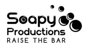
To prove my point, rather crudely, I have bought a logo from a “fiver-a-logo” service. I have put myself in the shoes of an average consumer and gone through the painfully abrupt process of briefing my chosen graphic designer “Amy” who promises, “I will design professional and realistic logo” for £4.95.
I’m sold on the promise of a realistic logo.
I lied through the process, (I am a terrible person), stating I have a production company called Soapy Productions, bearing in mind I didn’t specify what kind of production company. I also said that I like black and white. I added, rather diva-like, that it must have bubbles. You can see where I was cruelly going.
My specification was based on the usual level of initial contact a client might make with me. Most (not all) are unsure exactly what they want, but they like specific colours.
“It matches our sofa in reception.” True example.
So after a total of two minutes, my order was placed. I paid through PayPal and I received an immediate email thanking me for my graphic design order. Amy was already on the case. Poor Amy has no idea she was being used to prove a point.
18 hours later, my new logo arrived in my inbox. She must be a complete design ninja to have managed a logo design in such a short time.
The result was, well, expected.
By the time I got round to sending my alteration notes after 24 hours, the case was closed and I was stuck with this:
Now what?
Immediately, I can see how Amy has come to this abrupt design. It uses the Bubbleboddy typeface, in which the designer has clearly taken “bubble” to be the buzz word of the brief and done a quick search for bubble fonts. Bubbleboddy litters many free font download sites. Just saying.
As a designer, this logo does make me cringe. I did ask a few people their opinion, and there was a mixed response from “oh god…” to “it’s not the worst I’ve ever seen.”
Just to be clear, this is not a dig at Amy nor any of the graphic designers listed on so-called online skills farms. Although her public portfolio, like many others, was filled with suspect stock graphics with no hard evidence of any previous commissions.
It’s just that this particular logo is supposed to be for my business, albeit a fictitious business. Nonetheless, it has no personality. It has no voice – it doesn’t hook you in or tell you to consider my services. It is simply a bland representation of a generic production company.
This logo says “we’re a cheap production company with one confusing value – to raise the bar. Raise the bar for what? Not really sure. I’m not even sure what kind of productions we offer anyway. Do we produce cheesy karaoke nights? Yes, that must be it.”
So how much is a new logo?
A logo costs the value you put on it. It costs time, expertise, research, talent, an eye for detail. It costs the value of the customers it brings through the door.
You are guaranteed to get it for less than that, so consider it a bargain.